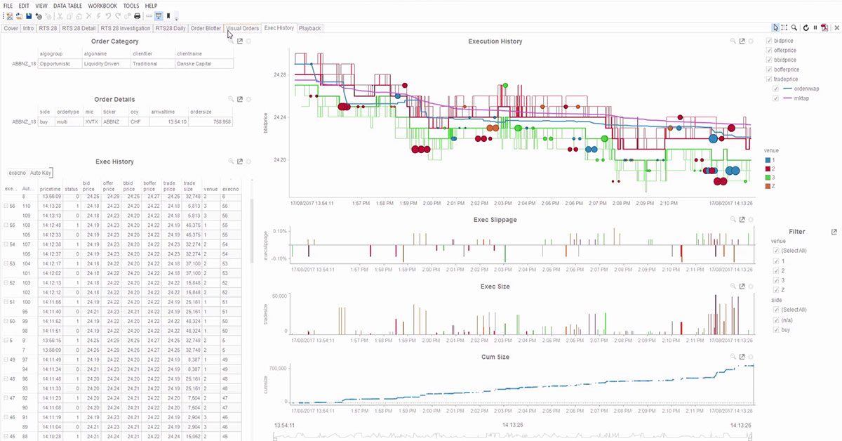
Panopticon Demo: Visual Monitoring and Analysis Applied to Best Execution

Tabular displays are useful in examining top level aggregated data, but quite limited when the number of rows grows to hundreds of thousands. This is especially true when dealing with data related Best Execution; there is an enormous amount of data to be analyzed, and the analysis must be conducted in a timely manner in order to be useful.
Specialized visual analytics tools make it much easier - and faster - to slice and dice the data to identify outliers and anomalies. We use different visual techniques to look at different aspects and dimensions in the data. When we spot a problem, we can drill into the child orders to figure out what is doing wrong. For example, visual analytics makes it obvious when a venue is underperforming, and since we can see what the issue is while it is happening, based on real-time trading data, we can reallocate our order flow to compensate during the trading day. We can also do "what if" analysis and understand what would happen if we redirected flow away from a particular venue.
Rather than using our data handling infrastructure only to generate reports as required by regulators or looking at end-of-day aggregated TCA data, we can effectively monitor and analyze all trades as they are happening and modify our trading activity to optimize our profitability and maintain compliance.
