Thought Leader Thursday: Nothing Between You and Your Design

The More Things Change…
A few years ago, I read the complete papers of Wilbur and Orville Wright that included nearly every note, letter, and calculation they performed over the many years of developing their first and subsequent flying machines. What struck me while reading their journals was how much they had in common with today’s engineers and designers. They didn’t have computers and simulation, but they had that same creative and analytical way of thinking all great engineers share. They were also prolific builders who created and tested working models of their concepts, refining them over and over until they understood the physics and could apply what they learned to improve their detailed designs.

First successful flight of the Wright Flyer. The machine traveled 120 ft. in 12 seconds at 10:35 AM at Kitty Hawk, North Carolina, 1903.
The second thing that struck me was how fast they did it. In just 4 short years, they went from knowing nothing about flight, to flying. Along the way, they developed an instrumented wind tunnel, initiated modern airfoil theory and propeller theory, designed and built a radically lightweight engine, created a light yet resilient airframe with wing warping, and invented a three axis flight control system. Their ability to innovate rapidly and radically was off the charts.
The Wrights’ airfoil was a product of extensive wind tunnel testing.
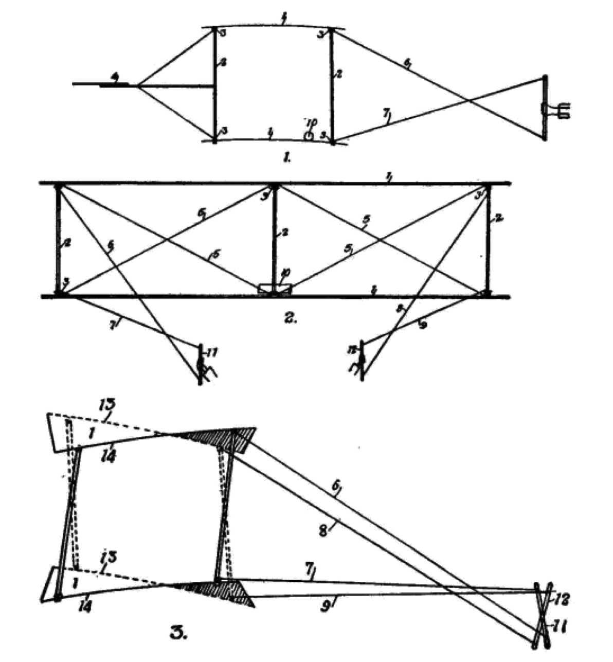
The Wrights patented their wing warping mechanism to control roll.
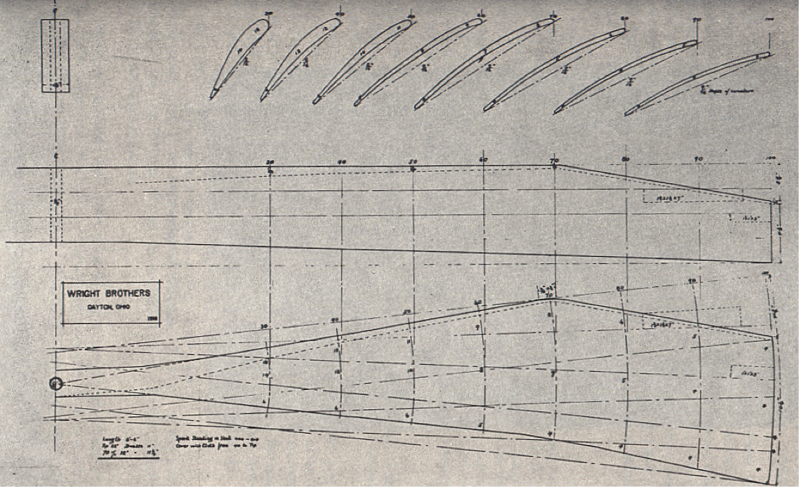
First true aircraft propeller using airfoil technology derived from their wind tunnel testing.
Humbling, isn’t it? As someone in the computer-aided design and simulation business, I often muse over what the Wrights would achieve with today’s software. Or would they actually feel encumbered and distracted by all the complex technology
and tools between them and their vision?
There’s certainly no question about the power and value of modern engineering software, but it has also brought a high burden of learning and specialization. Perhaps that’s a fair trade-off given the demands of modern engineering, but there’s a strong imperative to make simulation and optimization technology far easier to learn and apply.
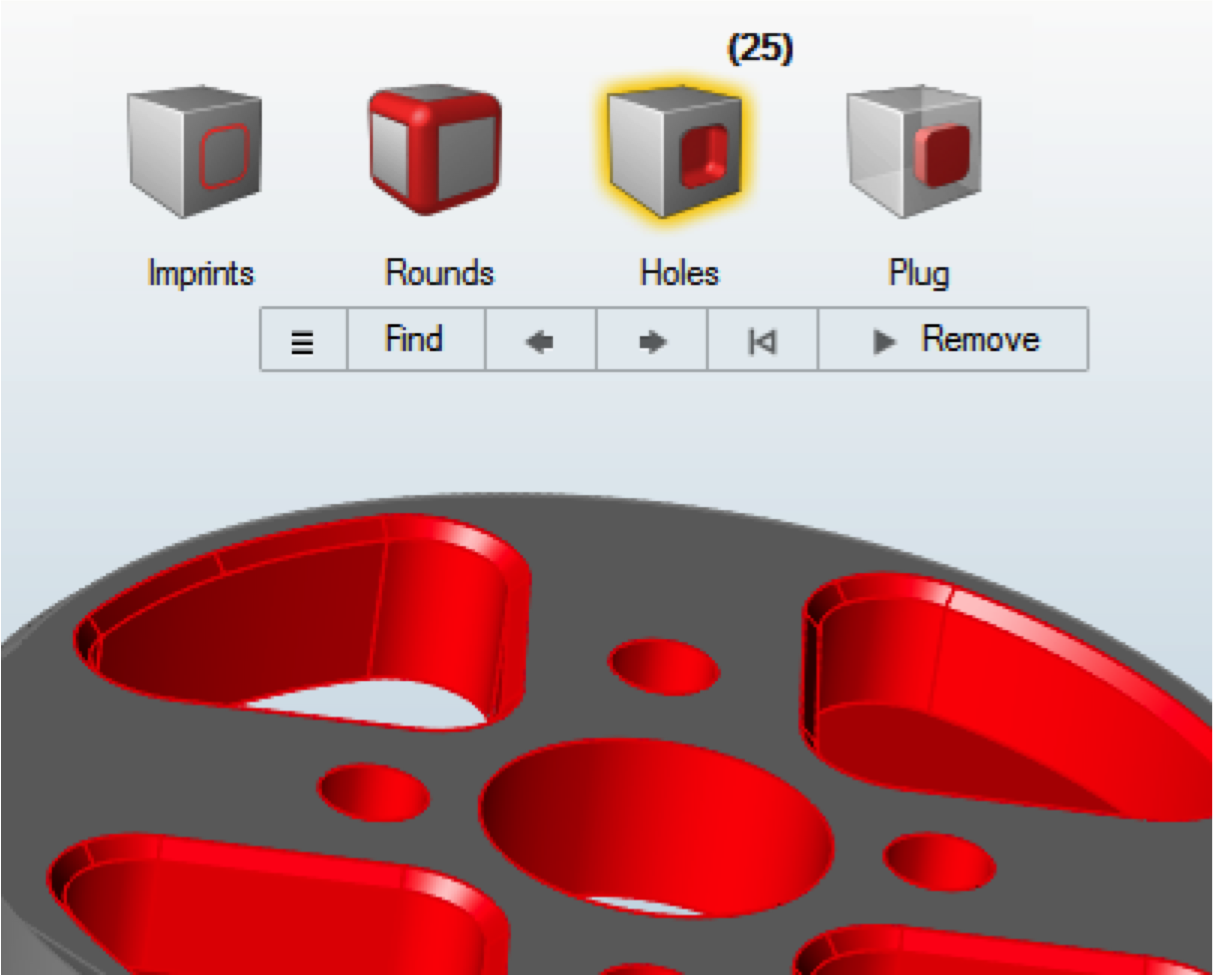
Improving the user experience of design, simulation, and optimization software is more than just minimizing mouse miles and organizing menus. It requires understanding human psychology, the creative process, and building more intelligence into the software. Baking more application knowledge into the software ultimately enables people to stay focused on their visions and goals without getting lost in the complexity of the tools.
Making the Complex Simple
Even if the user interface is physically easy to use, it can still be daunting to acquire the necessary knowledge to perform simulations. In fact, learning to use and master advanced solvers effectively can take years. However, much of the knowledge required to use solvers might not necessarily be about applying engineering at all—it’s about the solvers’ idealizations, limitations, data structures, solution controls, API’s and so forth. While many experienced users do need to master all those aspects of simulation, there are still many more who can leverage simulation for their particular applications if the specialized knowledge requirements could be minimized.
Therefore, the development of “vertical” or domain-specific solutions on top of generic modeling software is typically the best way to achieve this. An example of a vertical solution is the Virtual Wind Tunnel shown below, which allows designers and engineers to simply position a vehicle in a wind tunnel and then run a very sophisticated CFD simulation with little exposure to the complexities of the solver itself.
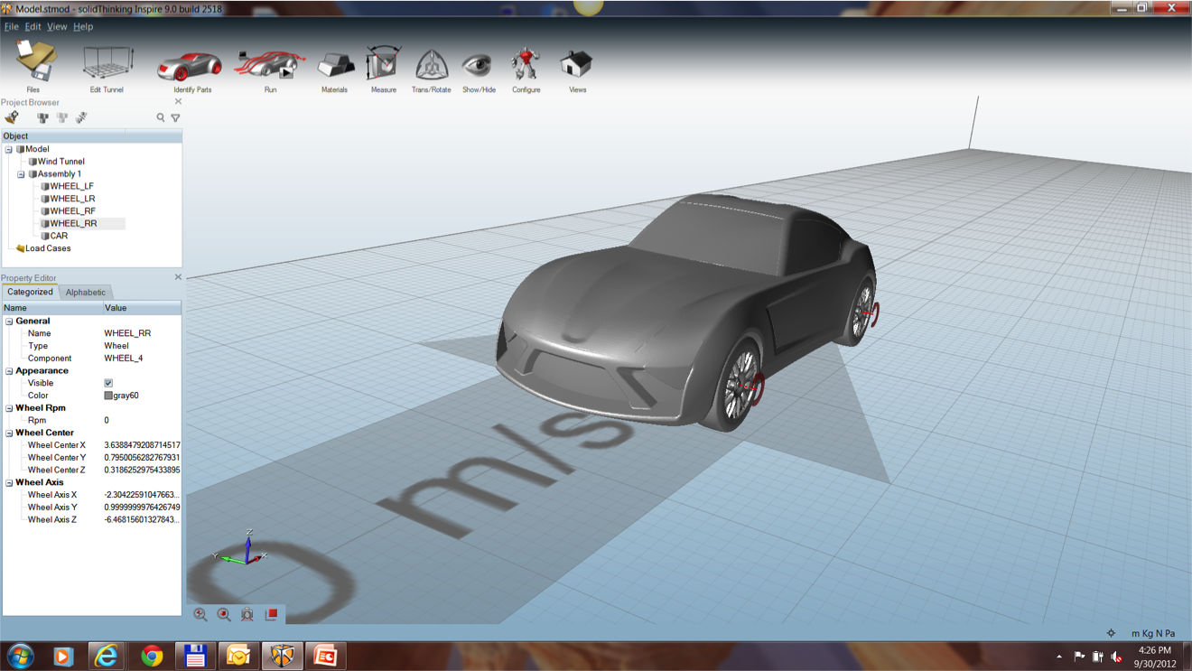 Example of sophisticated simulation made simple to use in Virtual Wind Tunnel.
The 90% Use Case
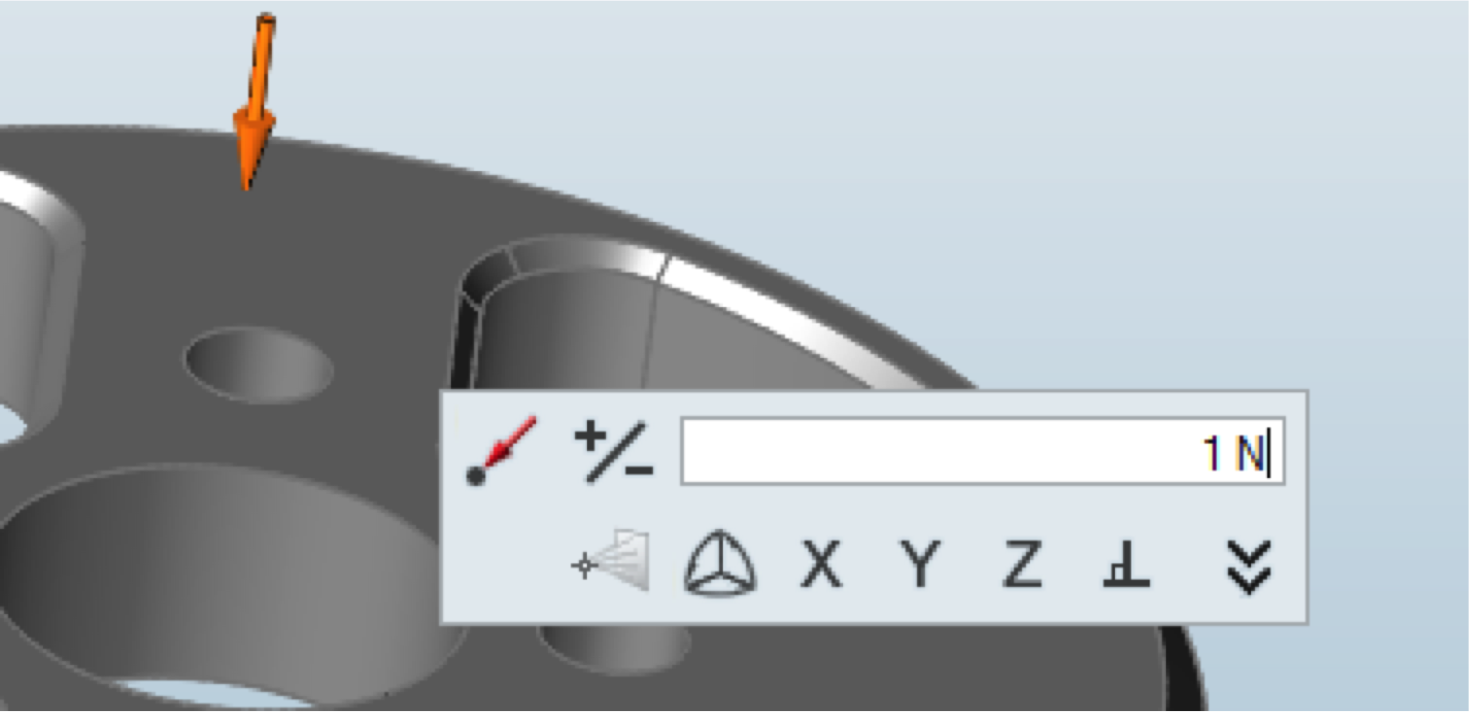
In large and complex engineering software products, users tend to utilize only a small percentage of the software capabilities for the majority of their time. We often refer to this as the 90% rule: a user spends 90% of his or her time using 10% of the product. As a result, we need to make sure that nothing blocks the user from finding, comprehending, and using that critical 10% easily and efficiently. Large dialogs with many options are now transforming to lightweight micro-dialogs and simple guide bars that expose only the most-used elements of a workflow.
Fostering a Productive State of Mind
Whether you are a gamer, a musician, an athlete, an artist, or an engineer, you aspire to experience “flow” while engaging in your activity. That’s the state of mind and body where you become so incredibly focused, you can effectively
tune out the outside world and your motions seem almost autonomic. You become less focused on controlling the details of your physical movements and more conscious of the big picture or problem you are trying to solve. Your thinking shift from language-based
to more conceptual. This state of mind often leads to receptiveness, insightfulness, and productivity. You become less mindful of time passing in this state and you often feel a great sense of accomplishment.

To foster this mind-body state, good UX designers must consider the physical aspects of using the software. Hand and eye motions should be smooth and should minimize abrupt modality shifts from gross motor to fine motor targeting. Frequent shifts of your arm from mouse to keyboard and back can feel laborious. Appropriate pick tolerances on fine details in the graphics and hover-over highlighting can make targeting feel effortless. Good cell phone apps generally feel effortless because they only require a few simple swipe and press motions using one hand, finger, or thumb. But do you notice how placing the text cursor via the magnifying glass on an iPhone feels like high effort? That’s because you just shifted to a very fine targeting mode that requires high concentration levels that interrupt your flow.

Learning Fast
How do you approach learning new software? Most people prefer to jump right into software rather than reading a manual. When you want to learn how to do home maintenance, fix your car, or play an instrument, where do typically go first? How about YouTube? Most people visit YouTube for a quick and short video tutorial, so it makes sense to place as much instructional material as possible on public video sites, like YouTube, where they are most likely to be found and easily understood.
While early attempts to provide pro-active contextual assistance like Microsoft’s now infamous paper clip were not well received some years ago, more subtle contextual hints have become the preferred method of guiding a user through new workflows today.
Ultimately, users can learn the mechanical aspects of operating software quickly since most products follow standard user interface conventions. Where users typically struggle is in learning how to string together sequences of tools within their software to achieve their end goal. It’s the modeling and simulation strategies that they need the most assistance with and require the most time to discover.
Looking Forward
The biggest leaps in the productivity afforded by simulation tools will come from adding the additional layers of engineering knowledge that make simulation and optimization accessible to a wider audience of engineers and designers. Making simulation technology safe, simple, and robust in the hands of non-CAE specialists will enable new generations of visionaries to achieve their ultimate goals without anything coming between them and their designs.


